How to Build Accessible Dark Mode (WCAG Contrast Done Right)

I assumed dark mode was the accessible choice by default. Dark background, light text, easier on the eyes, done. I shipped dark themes and felt a little virtuous about it.
Then I ran the contrast numbers on one of my own screens and half of it failed.
Here's the uncomfortable truth. Dark mode is not automatically accessible. Sometimes it's the opposite, because the thing that makes a dark theme feel sleek, low-contrast grays floating on near-black, is exactly the thing that makes it hard to read. Flipping your colors does not pass the test. Meeting the numbers does.
The short version: dark mode is only accessible when it meets the same WCAG contrast rules as light mode. Aim for at least a 4.5:1 ratio on body text and 3:1 on large text and interface elements, avoid pure black backgrounds and pure white text, and test every real color pair instead of trusting how the hero screen looks.
If you want the fuller version of the light-versus-dark tradeoff, I wrote a companion piece on designing accessible light and dark modes. This post is the focused one: how to get the contrast right in the dark theme specifically.
Is dark mode actually more accessible?
Not by itself. Dark mode is a preference that happens to help some people and hurt others, and whether it's accessible depends entirely on contrast, not on the fact that it's dark.
It helps people with light sensitivity and photophobia, and it helps in low-light environments. It can genuinely reduce eye strain at night. But for people with astigmatism, light text on a dark background can smear, an effect called halation, where bright letters appear to bleed into the dark around them. So dark mode is not a universal accessibility win. It's a mode you have to build correctly, the same way you build the light one correctly.
That matters because people really do live in it. In an Android Authority reader poll of 2,514 people, 81.9% said they use dark mode exclusively, and 91.8% use some form of it. That's a self-selected tech crowd, not the whole world, but it tells you the dark theme is not a novelty you can half-build. For a big chunk of your users it's the only theme they ever see.
What contrast ratio does dark mode need?
The exact same ratios as light mode. WCAG 2.2 doesn't have a separate, looser rule for dark themes. Contrast is measured as a ratio between the relative luminance of two colors, from 1:1 (identical) to 21:1 (pure black on pure white), and the thresholds are fixed.
Here's the whole thing on one screen.
Content type | WCAG AA (minimum) | WCAG AAA (enhanced) |
|---|---|---|
Body / normal text | 4.5:1 | 7:1 |
Large text (24px, or 18.66px bold) | 3:1 | 4.5:1 |
UI components, icons, form borders, focus states | 3:1 | not defined |
Disabled elements and pure decoration | no requirement | no requirement |

The trap in dark mode is the large-text and UI row. Designers nail the body copy, then set placeholder text, helper text, timestamps, and inactive icons in a dim gray that looks tasteful and lands around 2.5:1. It reads as "subtle." It reads to a screen magnifier user as "gone." If a sighted user with good vision has to lean in, you already failed someone with low vision.
Why you should not use pure black (and pure white)
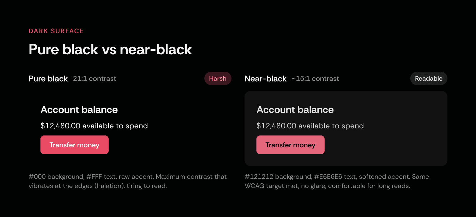
Pure black (#000000) under pure white text (#FFFFFF) hits a 21:1 ratio, so technically it passes everything. In practice it's one of the least comfortable combinations you can build.
That maximum contrast is what triggers halation. The white characters vibrate against the absolute black, especially for readers with astigmatism, and especially on OLED screens where true black pixels are fully off. Long reading sessions get tiring fast.
The fix the big design systems landed on is near-black, not black. Material Design recommends a dark surface around #121212 rather than #000000, and most mature dark themes set body text as an off-white (something like #E6E6E6) rather than a glaring #FFFFFF. You lose a little raw contrast and you gain a theme people can read for an hour without their eyes buzzing. You're trading an unusable 21:1 for a comfortable, still-compliant 15-to-17:1.
One more thing dark mode breaks that light mode doesn't: elevation. In light mode you show that a card sits above the page with a drop shadow. On a near-black surface a shadow is invisible, there's nothing darker to cast onto. Dark mode conveys elevation with lighter surfaces instead. The higher an element sits, the lighter its background gets. Which means your "elevated" surfaces drift toward gray, your text contrast against them drops, and the color pair you checked on the base surface is not the pair that's actually rendering on the modal. Check both.
How to build an accessible dark theme, step by step
This is the order I work in now, after getting it wrong the easy way.
Start from near-black, not black. Set your base surface around
#121212and build a small ramp of elevated surfaces that get progressively lighter. These are your real backgrounds, so every text check happens against them.Set text as off-white tokens, not
#FFFFFF. Define primary text, secondary text, and disabled text as named tokens. Then check each one against every surface it can land on. Secondary text is where dark themes quietly fail, so give it a real number, not a vibe.Desaturate your accent for the dark surface. A brand color tuned for white backgrounds is usually too hot on near-black. My own coral (
#e84b63) needs to be nudged lighter and slightly less saturated in dark mode to stay both on-brand and legible. Accent-on-dark still has to clear 4.5:1 if it carries text, and 3:1 if it's a button or control edge.Hold interface elements to 3:1. Icon buttons, input borders, toggle tracks, and focus rings are not decoration. They carry meaning, so they're bound by the 3:1 rule. Your focus indicator especially has to be obvious in the dark, because keyboard users are navigating by it.
Test every real pair, not the hero screen. The screen that looks great in the case study is not the risk. The risk is the disabled state, the toast on an elevated surface, the chart legend, the error text. Run the real combinations through a checker like WebAIM's contrast tool or Stark in Figma.
Respect the system, and let people choose. Honor
prefers-color-schemeso you match the device, but keep a manual toggle. Some people need light mode for exactly the reasons others need dark. Forcing either one on everyone is the opposite of accessible, which is the whole argument behind inclusive design: you design for the range of real humans, not the average one.
This is not a dark-mode problem, it's a contrast problem
Here's the part that should bother you. Low-contrast text is not some rare edge case we're chasing. In the February 2026 WebAIM Million report, low-contrast text was found on 83.9% of the one million home pages tested, up from 79.1% the year before, and it has been the single most common accessibility failure for seven years running. Most of those pages are in light mode.
So the problem was never the dark theme. The problem is that contrast gets treated as an aesthetic choice instead of a measured requirement, and dark mode just makes the bad habit easier to indulge, because dim gray on black looks intentional. The same discipline I had to learn building accessibility tooling, including the work on the EqualWeb accessibility widget, applies here exactly: you don't eyeball contrast, you check it, and you check the states nobody screenshots. It's the same lesson I took from doing a full accessibility teardown of Pokemon Sleep, where the calm, comfortable surface was the result of careful contrast decisions, not the absence of them.
Key takeaways
Dark mode is not accessible by default. It's accessible only when it meets the same WCAG contrast ratios as light mode.
The targets are 4.5:1 for body text, 3:1 for large text and UI elements, and 7:1 if you're chasing AAA.
Skip pure black (
#000000) and pure white (#FFFFFF). Use a near-black surface (around#121212) and off-white text to avoid halation.In dark mode, elevation is shown with lighter surfaces, so always re-check text contrast on elevated components like modals and toasts.
Secondary text, disabled states, and focus rings are where dark themes fail. Test the states nobody screenshots.
FAQ
Is dark mode more accessible than light mode?
What contrast ratio does dark mode text need?
Should I use pure black for a dark mode background?
Why does white text on a black background look blurry to some people?
How do I check if my dark mode meets WCAG contrast?
Does dark mode use more or less contrast than light mode?
Share on